top of page

Your personalized emoji

What you’ll find below is a case study showing Bitmoji Integration, potential solutions to offer better Bitmoji user experience, as well as ideas for future development.
My process was guided by qualitative user research, Bitmoji’s official Brand Guidelines, and my own design intuition.
1. Bitmoji Integration
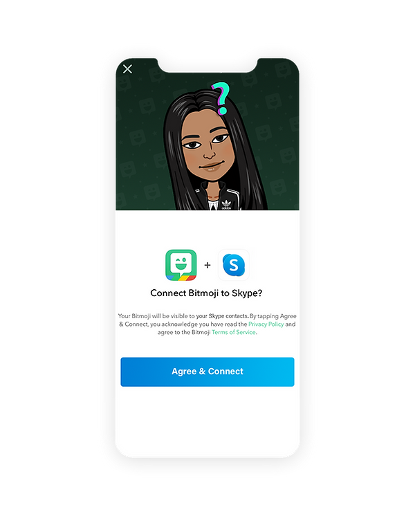
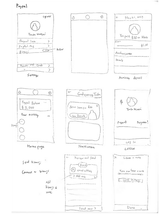
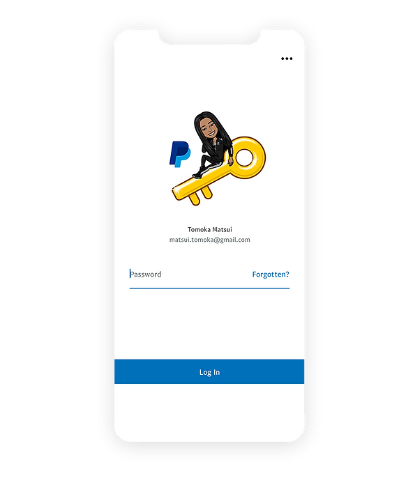
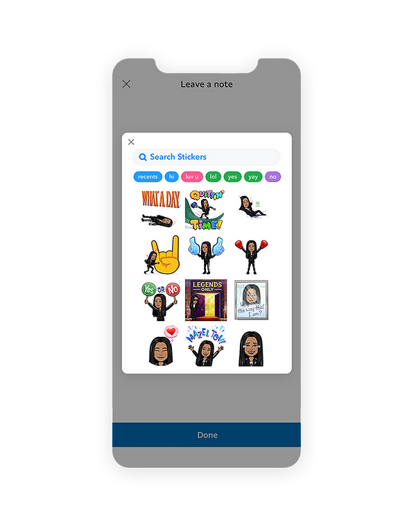
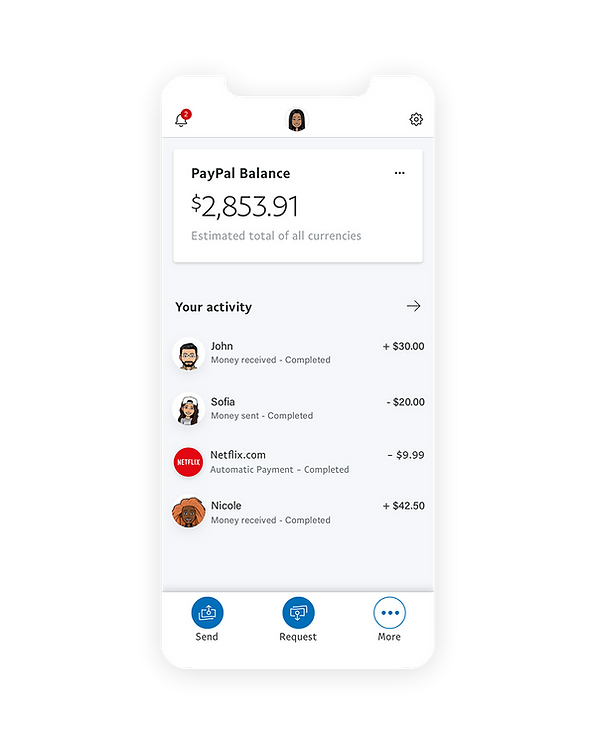
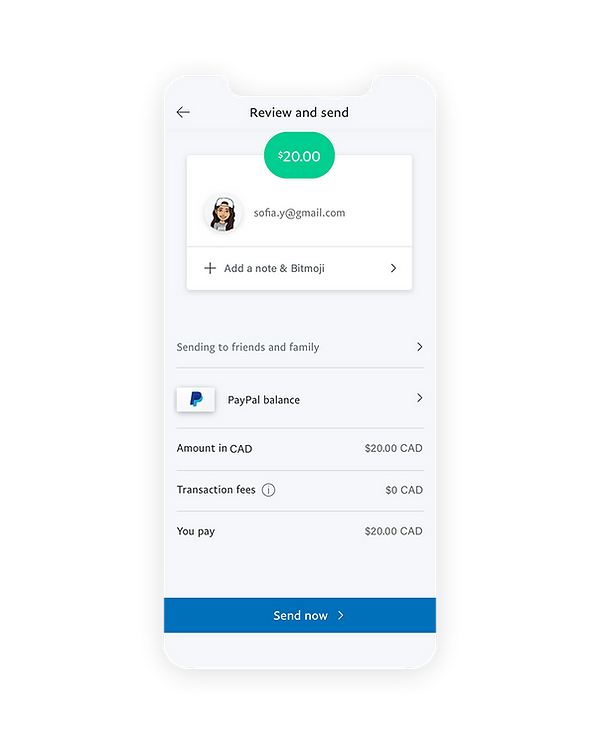
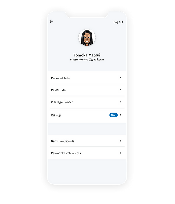
When it comes to integrating Bitmoji into other services, it is necessary to remember that Bitmoji's brand identity has to be noticeable, but should not be louder than the other service's brand identity. I chose Skype and Paypal for this case study. There's a large number of requests for Skype-Bitmoji integration, and Paypal-Bitmoji integration should not be difficult since Bitmoji is already integrated into Venmo.

Rough sketch
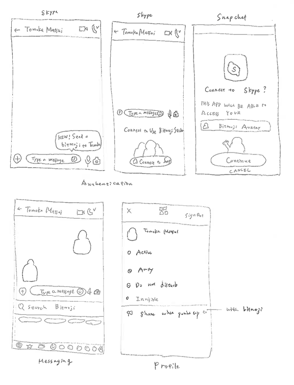


Rough sketch


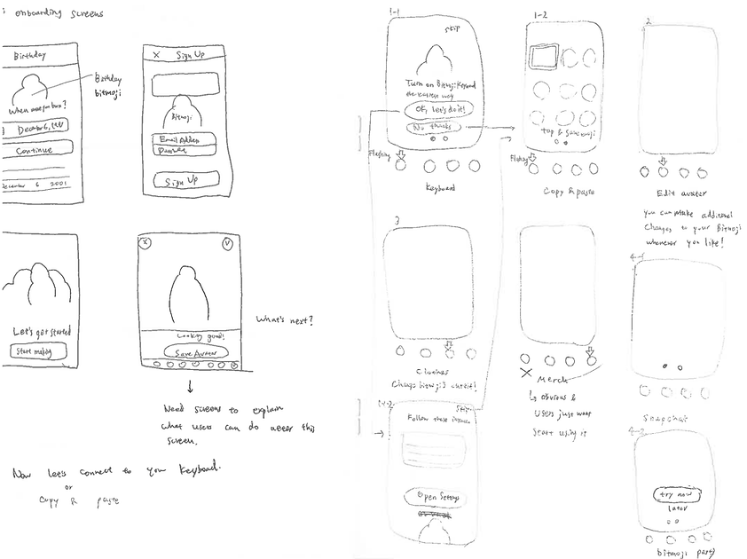
2. Bitmoji App Onboarding Flows
App onboarding is the process of getting new users to understand and engage with your app enough to keep using it, instead of abandoning it after the download or the first use.
1. Splash Screen
This screen holds the key for the user to actually go ahead with the account registration process or abandon after downloading Bitmoji app. I wanted to make this screen slightly more delightful while keeping the same brand language.


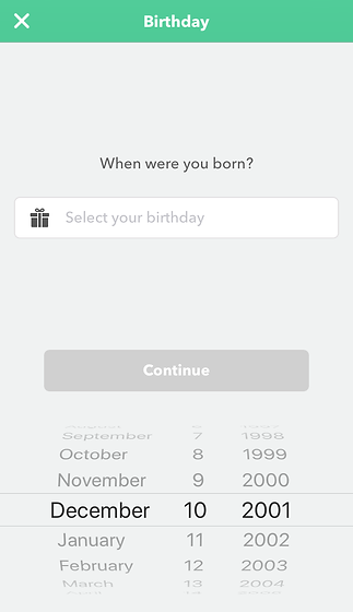
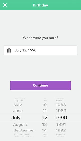
Current design
My proposal
2. Sign up / Login Screens
I noticed that the current sign up & login screens do not have the consistent design language. They're not noticeable unless you're paying close attention to, however, I believe it's crucial to have one true design language that's scalable in order to keep the strong branding.
Colour code: #f0f0f0
It should be #ffffff like the other screens.
Colour code: #4fc994
It should be #39CA8E (Bitmoji Green specified in the brand guidelines.
Colour code: #cfcfcf
#333333
#575757

Font is different from other parts of the app
This button should be light grey (#cfcfcf) until the information is inputted

#ced9d5
It should be #cfcfcf to be consistent.
It should be a rectangular button instead of a round button like the other pages.
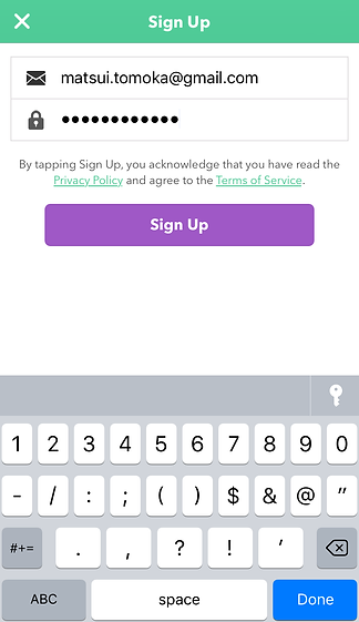
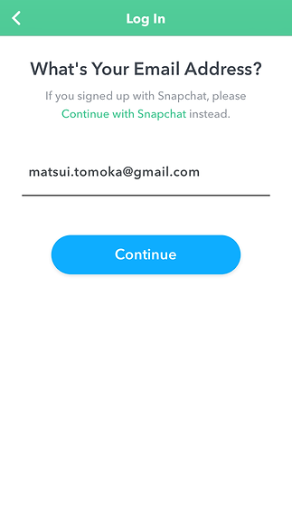
Blue is used instead of purple here. I believe it should be consistent throughout the app unless there's a special meaning behind it.
My proposal


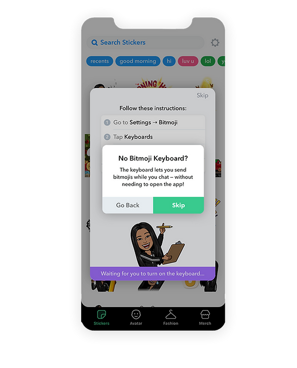
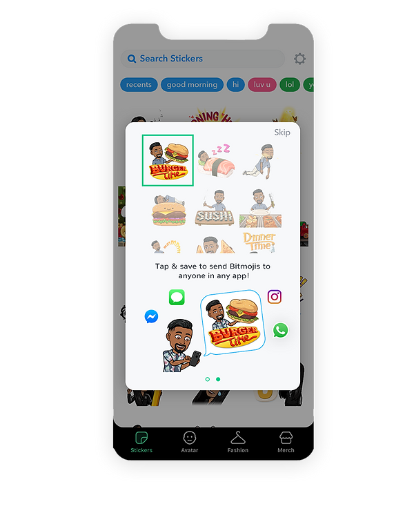
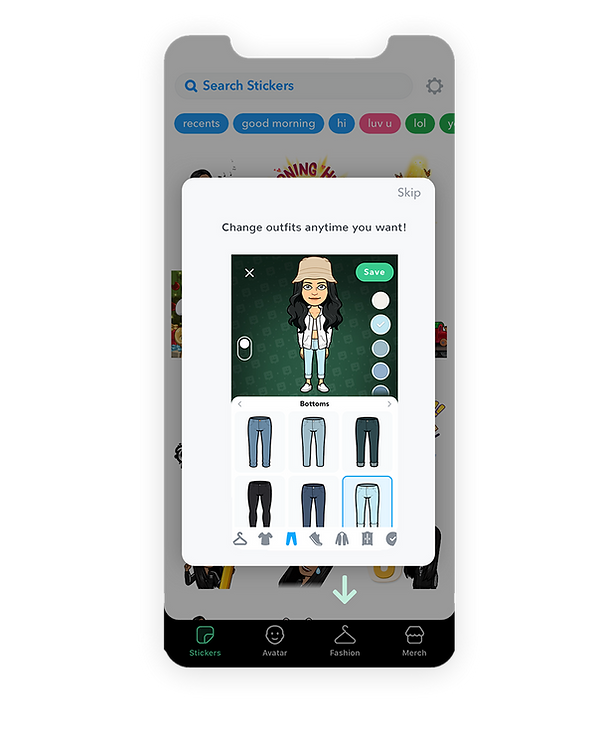
3. Overlay Screens
The most complaint I heard about the current app experience was that it's not obvious where/how to use Bitmoji stickers once the avatar is made. To resolve this, I created some overlay screens that educate users what the next steps are. The end goal is to educates users how the app works without making them think and help users get to their goal as quickly as possible.


4. Others
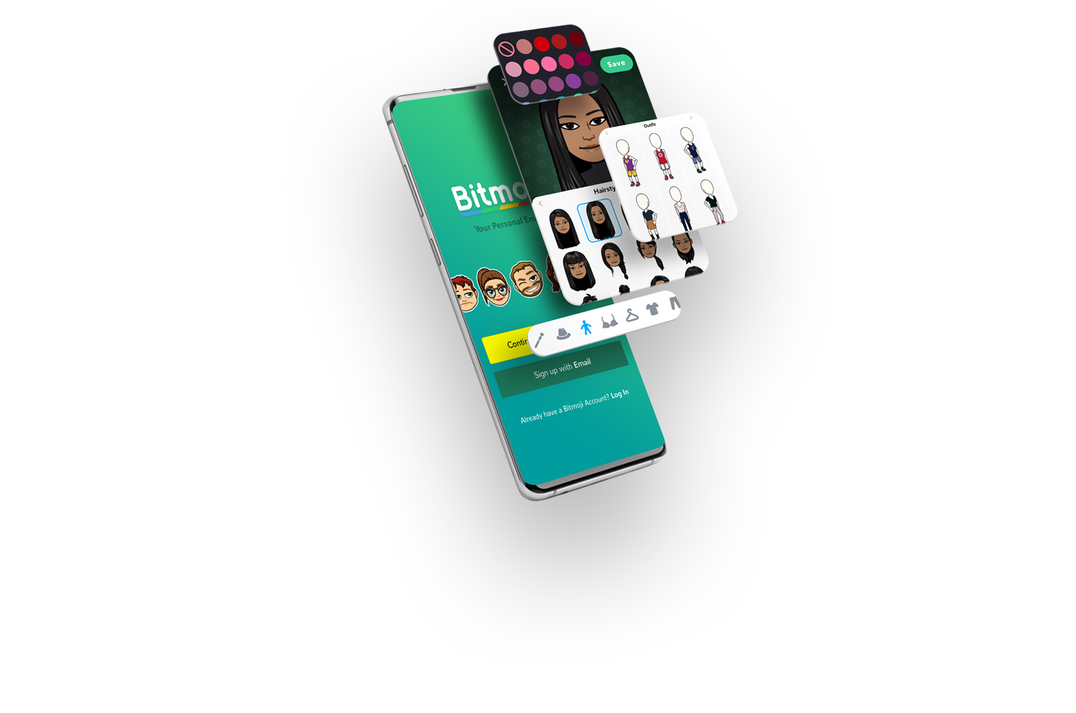
1. Outfit search option
Since the app update at the end of November, we can now mix & match clothing pieces. However, there is no outfit search option anymore. Since there are so many outfits, it's better to have search options so users can find what they want as quickly as possible. And in order to keep adding new contents while avoiding the app to be heavy, we could make contents downloadable (especially the clothing pieces).


bottom of page