top of page

Your favourite food,
at your fingertips
Case study for interactive restaurant recommendation feature for Uber Eats
Everyday, Uber Eats connects people and restaurants all around the world, delivering customer’s favourite restaurants to their doorsteps, while helping restaurant owners get their food to customers as fast and as efficient as possible.
Uber Eats is the top food delivery app, and in order to keep excelling as the leader of the industry, I wanted to come up with ideas that make the food ordering even quicker, easier and more fun for everyone.
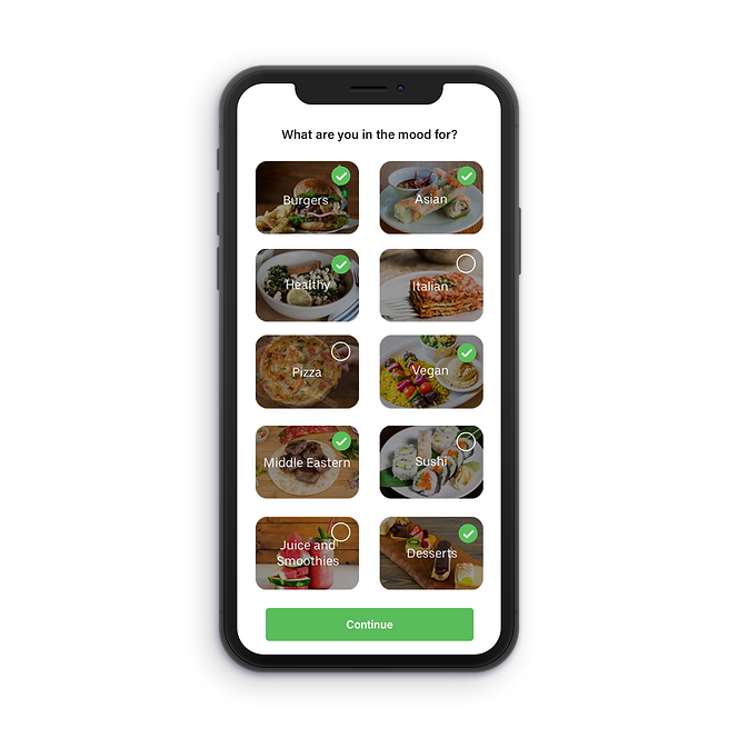
We all have days where you’re too tired to think about what to eat, or cannot even figure out exactly what you’re in the mood for.
For some people, decision making can be stressful and takes way too much time to decide the simplest things such as what to wear for the day or what to eat. I wanted to come up with an idea that makes decision making a game, and provides more fun and delightful user experience.
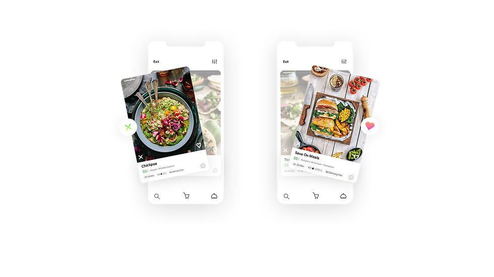
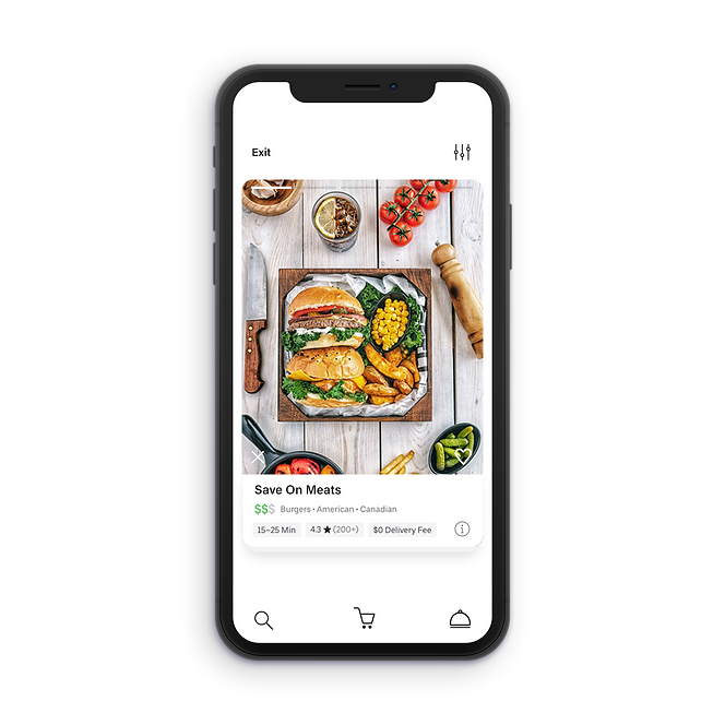
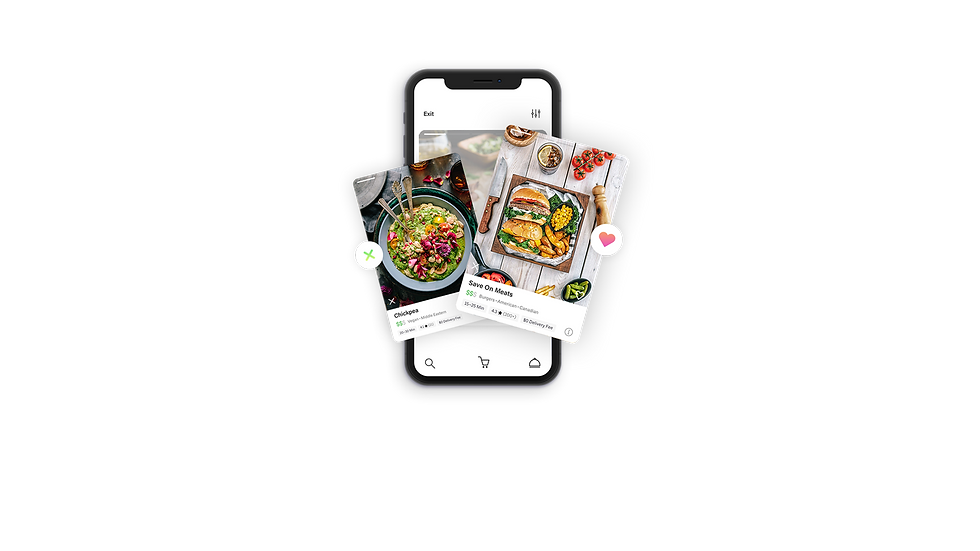
Seeing helps deciding - “Swipe to discover” feature helps users choose their next meal by swiping left or right on dishes from the best restaurants nearby and makes the decision process easier.
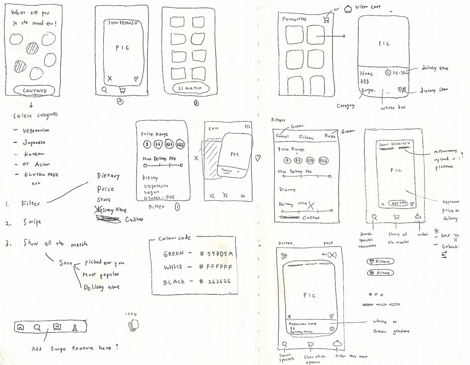
Sketch
Navigation Style
When designing UI & UX, it's essential to create a navigation structure that's logical, predictable, and straightforward, so that users can get to the right content with a minimum number of taps and swipes.
The goal is to design a navigation style that supports the app structure and purpose without drawing attention away from the content.
Users should feel natural navigating through the app and they should always know how to get to their next destination.
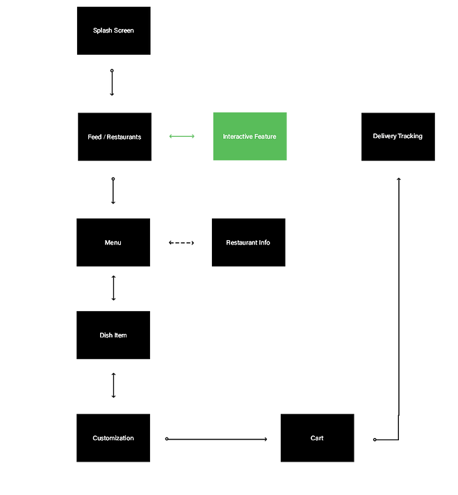
Flow Chart


Swipe left
to dislike
Swipe right
to like
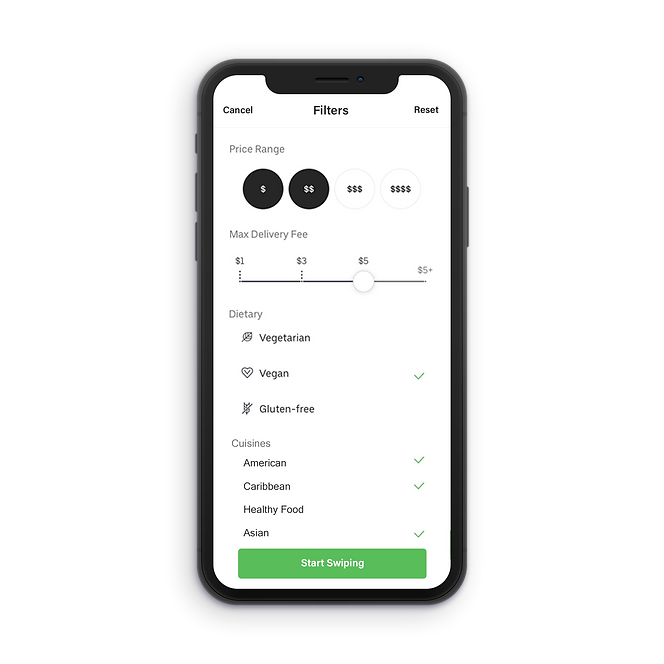
Filters
Search
Cart
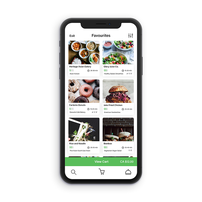
Favourites
All of the liked items are saved to "Favourites"

bottom of page