top of page


UI Designer
Design Challenge
Make Bitmoji creation better -
"Bitmoji Avatar Builder / Fashion Designer"
Understanding the challenge
Bitmoji - As the technology developped, communication became more and more convenient and less and less human. Bitmoji is a digitalized you and it fills a gap between face-to face communications and texting. Bitmoji stickers not only add feeling to conversation and allow you to tell if someone is being sweet or mad, but also adds identity and make online communication more personalized and fun!
I believe that UI/UX design is a bridge that connects people and technology, and creates a better understanding between them. Successful product design comes from understanding users’ behaviours, anticipating and emphasizing with what the users want, and being able to think from their perspective.
The goal of this design challenge is to think of ways to make the Bitmoji creation flaw clear and simple, and educate users how the app works without making them think, and help users get to their goal as quickly as possible, while reinforcing the Bitmoji brand.
As a designer, you'd always want to create a delightful and stunning UI that stands out. However, I always tell myself to step back and think of big picture before starting the design process. When designing apps, it's important to consider not only the design aesthetics, but also engineering efforts required, time, money, system constraints and skills of developers.
Sketch
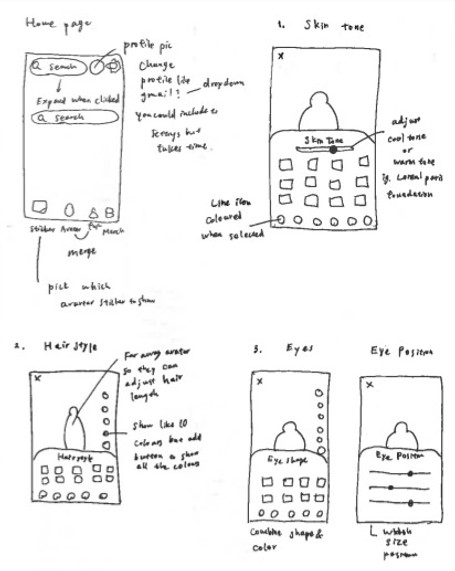

Current Flaw
.png)
Bitmoji Avatar Creation Flows
Splash Screen
This screen holds the key for the user to actually go ahead with the account registration process or abandon after downloading Bitmoji app. I wanted to make this screen slightly more delightful while keeping the same brand language.


Current design
My proposal
1. Skin Tone
In this screen, I wanted to add a colour adjustment bar so that there's no shade limit. Users can pick a base colour from the preset options and further adjust the tone to match their skin tone.
Use icon instead to move away from using words.

Current design

Add these buttons to make it easier to go one step back. It'll be useful especially when picking colours and outfits.
My proposal
2. Hairstyle
In this screen, I wanted to combine Hairstyle and Hair Colour so that it's easier and faster process for users. I decided to add a vertical colour picker since that's already built in the Clothing screens. I also added an adjustment bar for hair length. There are many complaints that there aren't enough hairstyle options. Being able to adjust the length after picking a style will create more options without having to add new hairstyles.


Current design
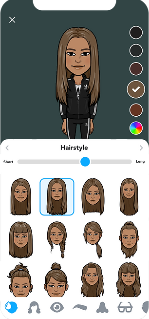
Make it so that users can change the hair colour in the Hairstyle screen.
Users can change the hair length here so that there's more customization options.

Add a colour picker button so that users can custom pick a colour. This button should be shown at all times so users don't have to scroll all the way to the bottom to find this.
My proposal
3. Eyeshape
In this screen, I combined Eye Shape and Eye Colour so that it's easier and faster process for users.


Current design

My proposal
4. Eye Position
I combined Eye Size and Eye Spacing and created Eye Position screen. In this screen, users can not only adjust the size and spacing, but also the position, height, and the angle with adjustment bars.


Current design
Height
Spacing

Size
Position
Angle
My proposal
5. Eyebrows
In this screen, I made it so that users can pick an eyebrow shape and a colour at the same time. I also added an adjustment bar so that they can adjust the thickness of the brows.


Current design

Adjust the thickness here.
My proposal
6. Eyelashes
In addition of the current options, I wanted to add an adjustment bar so that users can pick the length/volume of eyelashes.

Current design

Pick the length/volume of the eyelashes here.
My proposal
7. Nose
No changes were made in this screen other than the addition of "Back/Forward" buttons.

Current design

My proposal
8. Glasses
I wanted to add colour picker to this screen so users can pick a base style and add a custom colour. This way, there's more customization options for users and we can get rid of repetitive shape and swap with new styles.

Current design

My proposal
9. Face Shape
I combined Jaw and Face Shape screens and added two adjustment bars where users can adjust the face length and the width.

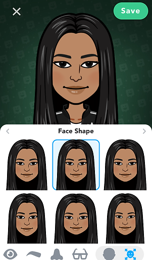
Current design
Pick a base shape first, and then further customize with adjustment bars.

Length
Width
My proposal
10. Mouth
I combined Mouth and Lipstick screens and add two adjustment bars where users can adjust the lip width and the thickness.

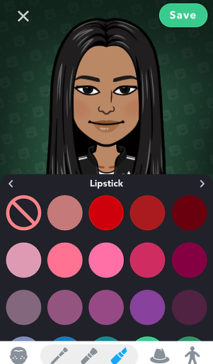
Current design
Adjust the thickness
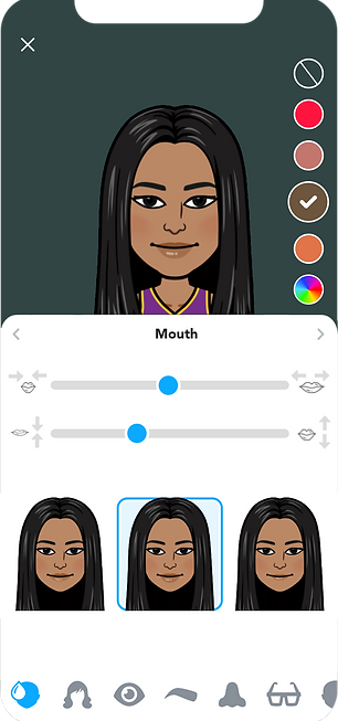
Adjust the width
Pick a base shape
My proposal
11. Ears
No changes were made in this screen.


Current design
My proposal
12. Cheek Lines
No changes were made in this screen.


Current design
My proposal
13. Forehead Lines
No changes were made in this screen.


Current design
My proposal
14. Eye Lines
No changes were made in this screen.


Current design
My proposal
15. Eyeshadow
Dark background might be used to make the colours pop and make it easier for users to pick a colour. However, to stay consistent, I changed the background colour to #ffffff to match the other screens since even the lighters colours are not hard to see with white background.

Current design

Changed to grey so it's consistent throughout the app.
Add this for more colour variation.
My proposal
16. Blush
Same changes as the Eyeshadow screen were made.

Current design

Changed to grey so it's consistent throughout the app.
Add this for more colour variation.
My proposal
17. Headwear
Same as the Glasses screen, I added colour picker so users can pick a base style and pick a custom colour. This way, there's more customization options for users and we can get rid of repetitive shape and swap with new styles.
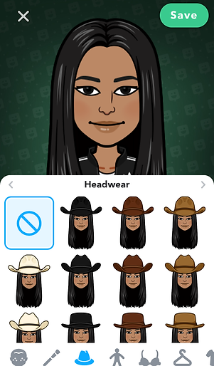
Pick a base shape.
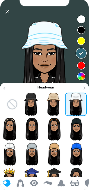
Pick a colour.
Current design
My proposal
18. Body Type
Many of the complaints/requests on app stores were about this page, and users are looking for more body type options. I added an adjustment bar to solve this issue.

Current design

My proposal
19. Chest Size
Same as the Body Shape screen, I added an adjustment bar for more customization.
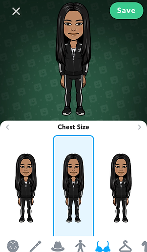
Current design

It'll be better if we could find an icon instead of using text
My proposal
20. Outfit
Currently, there are a lot of outfit options, but since the search bar was removed after the recent app update, users need to scroll down a lot to find an outfit they like. To make this process better, I made the following three changes.
1. Added a heart icon where users can favourite outfits they like while scrolling.
2. Added back the search bar that links to the categories screen when clicked.
3. Users are constantly looking for new outfit additions. In order to keep the app size relatively small, I made some contents downloadable.

Current design

Favourite

Downloadable contents.
Categories

My proposal
21. Save Avatar
On app stores, there are many requests for a function where users can create more than one avatars so that users can create avatars for their family members like parents, grandparents, kids, partners, and pets (future development idea). In order to do that, I created a pop-up screen where users can name avatar and save at the end of the avatar creation step.

The same static image that shows throughout the creation process doesn't give me a sense of accomplishment at the end of the process.
Current design
The small animation it used to show before the late November update added more delight to the process.
My proposal
22. Home
I created this dropdown pop-up for when we add a feature where users can create more than one avatars. Users can easily switch Bitmojis by clicking the profile image and change avatars.

Current design
Click to switch Bitmojis
My proposal
Other feature ideas
The followings are some of the ideas I wanted to implement but could not in the actual mockups due to time constraint.
1. In-app sound
00:00 / 00:01
Selection sound
Cancel/Back sound
00:00 / 00:00
In addition to those in-app sounds, we could also create Bitmoji theme song that plays in the background during the avatar creation process like Nintendo's Mii channel music.
2. Background colour
The current background is dark green with black gradient and it lacks delight. To increase user engagement, we could create a colour selection in the settings page and let users pick their own background, or we could automatically change it depending on time of day or season.
3. Line Icons
Currently, Bitmoji app uses filled icons. Using line icons give the interface a cleaner and modern look. I could not swap them with line icons in the mockups due to time constrains, however, the followings are a few examples icons I would have liked to use.


Adding in-app sounds is one of the ways to make the avatar creation process more delightful and fun. The followings are some of the examples.
Thank you for your time!

bottom of page