UI/UX Design
How I self taught UI/UX
I believe that UI/UX design is a bridge that connects people and technology, and it creates a better understanding between them. To be a great UI/UX designer, you need to be good at listening, communicating, and have empathy. Successful designs come from understanding users’ behaviours and emphasizing with what the users want and being able to think from their perspective, as well as having a good understanding of the technology. (Human centred design)
While good UI makes the flaw clear and simple, good UX educates users how the app works without making them think and help users get to their goal as quickly as possible. UX design is all about finding the perfect spot where users’ needs and business objectives meet, while giving them a flawless and pleasant user experience.
I started off by reading design guidelines (both iOS Human Interface Guidelines and Google Material Design).
Having a good communication and building trust between developers and designers is the key to building great apps. As a company, we all want to create an app that looks and feels great. Designers are focused on creating delightful UI/UX and developers are focused on writing code that's flawless and unbreakable. Here are some points we kept in mind in order for both teams to have a good communication.
1. Use the same technical terminology
Using the same terminology between the design and development teams eliminates confusion/frustration, and saves time.
2. Store finalized designs all in one space
Since so many design revisions are made during the process, it's important to have one source where all of the finalized and approved designs assets are stored and shared with every team.
3. Learn to weigh design aesthetics and engineering efforts
As a designer, you'd always create a delightful and stunning UI that stands out from the competitors. However, it's important to step back a bit and think of big picture. When designing apps, it's important to consider not only the design aesthetics, but also engineering efforts required, time, system constraints and skills of developers. Instead to creating everything from scratch, we started with the standard OS resources you can get for free in the SDK to shorten the development process. When creating custom designs, we communicated with the engineering teams to discuss whether it is worth the effort.
4. Demonstrate the design with dynamic prototypes
When working with a tight time schedule, it can be hard to demonstrate the UX with an interactive prototype rather than static screenshots. However, demonstrating with dynamic prototypes or even communicating in person and explaining the flaw is important to avoid misunderstanding between the teams and saves time down the road.
Diitalk UI Design
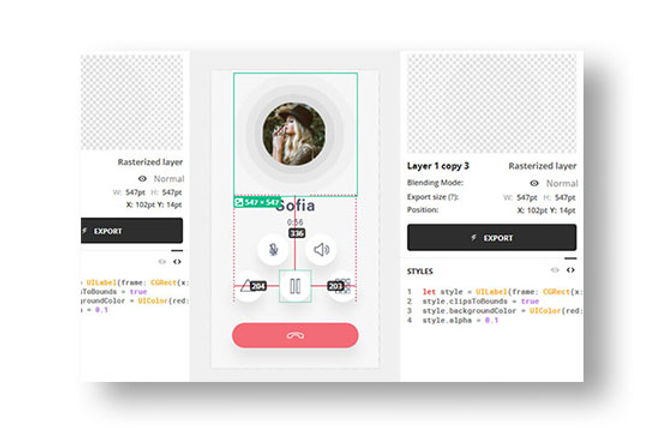
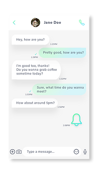
Colours: Using branding colours throughout the app interface is a great way to provide context in the app. We made sure to use colours that have sufficient contrast ratios so that it's easy to read contents for everyone. Used an online colour contrast calculator to accurately analyze the contrast in our app. Minimum contrast ratio is 4.5 : 1, and our finalized colour contrast ratio was 5.71 : 1. After choosing the app's colour scheme, we tested it in under various lighting conditions including indoors, outdoors, various weathers and time of day.
Shape: In addition to colours, using shape consistently throughout the app is important to communicate brand's visual language, as well as to indicate a state change. Like colours, using different shapes make some parts of a screen stand out and direct attention.


Terminology: It's important to be mindful that technology can be intimidating and using technical terms would make users feel uncomfortable in the app. For example, instead of using technical terms such as "PSTN calls" and "VoIP calls", we use more familiar and understandable terms such as "Dialled calls" and "App-to-app calls". Our app must be approachable and easily understandable to everyone. In addition, we made sure to keep text as short and concise as possible so that users can get the most important information quickly and figure out what actions to take next.
System icons: Used minimal icons that are similar to iOS or Android built-in icons as much as possible so that users are already familiar with the meaning of each icon.
App
Since our app is available for both iOS & Android devices, and it's important for us to have consistent branding, I made sure my design was implementable for both iOS and Android. Furthermore, I ensured it's intuitive, easy to use, and focuses on the right content by using key gradient colours on interactive elements.
Navigation style
As a UI/UX designer, it's essential to design a navigation structure that's logical, predictable and straightforward so that users can get to the right content with a minimum number of taps and swipes. The goal is to design a navigation style that supports the app structure and purpose without drawing attention away from the content. Users should feel natural navigating through the app and they should always know how to get to their next destination.

Framework

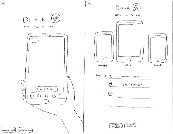
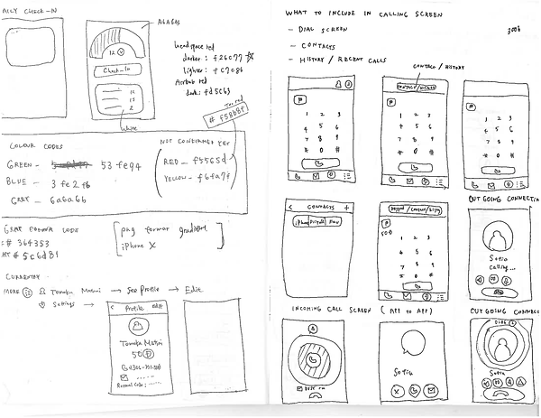
Sketches


Mobile Web


Web