Brand Overhaul
When I first joined the company, the original branding was called "Dingaling". Since the name had negative connotation in English speaking countries, our goal was to do a complete brand overhaul including the name, the logo, colour schemes, and the corporate identity.
For any design project, defining the proper visual language is crucial. We started the brand overhaul for Dingaling by looking at the existing style, analyzing design trends on app stores, and made significant changes that better advance user experience in order for the company to more effectively convey intended messages to the users. Our objective was to express the brand identity though colours, fonts and shapes, and provide users context in our app subtly and seamlessly.
Original branding


Rebranding Process
Name
We came up a new name “Diitalk”. “Di” is the root of Latin words meaning to “talk” or “say”, so essentially the brand is “talktalk”. Diitalk can also stand for “Dial International Talk” or “Dingaling 2.0 Talk” and is a natural progression from the original Dingaling brand (which will aid in the transition of old Dingaling users onto this new platform). Having “Talk” in the brand itself will also help with ASO (Appstore Optimization) & SEO (Search Engine Optimization) visibility, because when users search for “talk” or “talk on the phone” or “talk app” Diitalk is much more likely to appear in the search results. DLC plans to promote Diitalk as the only full-featured calling platform available for worldwide communications. To further strengthen the Diitalk brand, consistent imagery, phrases, colouring, and simplicity have been used in both the apps and website. Long-term the Company hopes to attract new users to the Diitalk platform through brand power alone. This name and the associated logo have been submitted as trade marks in the United States & Canada.

Colour Scheme
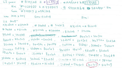
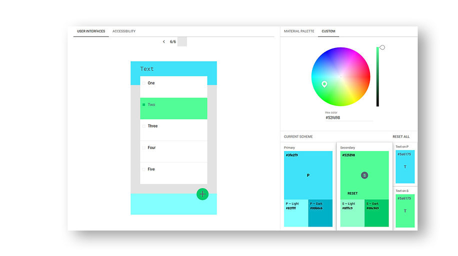
During the redesigning process, a lot of thoughts were put into deciding branding colours. We wanted to pick colours that would strike a first impression while maintaining the "international free calling & messaging" message that Diitalk wanted to convey. Since Diitalk is available worldwide, we had to consider how colours are perceived in certain countries and cultures, and made sure our choice of colours would send the appropriate message.
We started by researching colour psychology and picked two primary colours; Blue & Green.
On app stores, the biggest free calling apps' colour is blue (i.e. Skype, Dingtone, Talkatone, etc) and the biggest messaging apps' colour is green (i.e. Whatsapp, Line, Google Hangouts, etc). By combining both colours, we hoped to convey the message that Diitalk is a free calling & messaging app. In addition, green and blue symbolize the colour of earth, which can convey a hidden meaning that the app is international, and connecting the world together.
Positive implications of blue:
-
Trust
-
Loyalty
-
Dependability
-
Logic
-
Serenity
-
Security
Positive implications of turquoise green:
-
Communication
-
Clarity
-
Calmness
-
Inspiration
-
Self-expression
-
Growth


Logo / App Icon Design
Logo and app icon is the first opportunity to communicate what the app is about at a glance. The main goal of redesigning the logo was to educate people what the Diitalk's purpose is and introduce Diitalk in a clear and intuitive way. We wanted to create a logo that gets the message across and makes sense for a first-time viewer.
We wanted to come up with a logo that's simple yet expresses the essence of the app.
We first came up with the the Đ symbol, whose negative space makes a phone (CALL). Then added a speech bubble to communicate the messaging aspect of our products (MESSAGE). Đ is also a symbol of our in-app currency which implicates the third part of our slogan (EARN).
_JPG.jpg)


